Wednesday, June 16, 2010

Detergent doesn't have to be boring

Take a look at this "double truck" (2 facing pages) ad, found in People magazine. Font selection, contrast of type sizes (Fresh Air is much smaller and spaced out), type styles (lowercase Method logo combined with all caps), eye-catching colors.


Open leading and a headline in all lowercase has a casual feel.


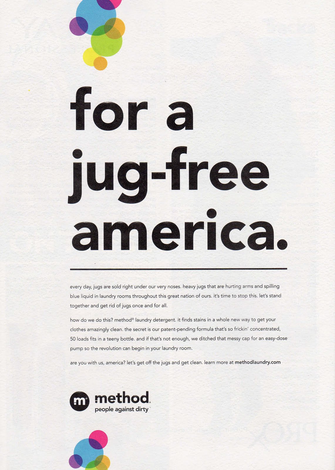
Now read the body copy. Click to view larger. All lowercase with periods…gives a fun, non-traditional, almost rebellious feeling. This is emphasized in the written text which sounds young, anti-establishment funny. I just might buy this detergent! 


Leave a comment. What do you think?

Friday, June 4, 2010